Music genres are a reflection of cultural shifts and societal evolution, capturing the spirit of each era from the 1950s to the 2000s. By examining how genres rise, fall, and influence one another, this project offers a window into the diversity of human expression and the dynamic relationship between music and culture.
To bring these insights to life, I leverage D3.js for interactive data visualisations, combining line graphs, timelines, and compatibility tables to present trends and relationships in an engaging and accessible way. The project also utilises JavaScript, SVG manipulation, and data transformation techniques to process and display complex datasets.
My goal is to transform complex data into a clear, visually appealing narrative that highlights music’s interconnected and ever-changing nature.
In the following sections, I outline the story uncovered through the data, divided into three key parts: Popularity, Comparison, and Compatibility. Each section represents a distinct visualisation, showcasing different aspects of the dataset.
Research
What Data is being used?
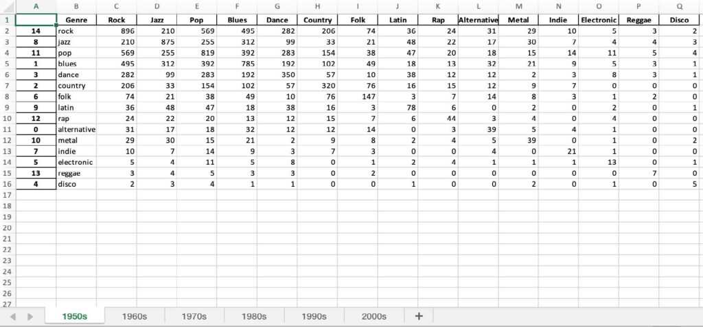
For this project, I utilised a processed dataset derived from the Million Song Dataset, curated by Columbia University’s LAB ROSA.
Though incomplete, the dataset’s 362,154 genre-tagged tracks provided a solid foundation for analysis, focusing on decade-specific tables of cross-tagged songs to inform my visualisations. Included and relevant Information:
Track ID: Unique identifiers for each song
Genre Tags: Associated genres for each track
Year of Release: To track changes over decades
The numbers between two genres represent their cross-tagging frequency, highlighting their compatibility. Higher values indicate more frequent associations, reflecting stronger relationships between genres.
Similarly, the values where a genre intersects with itself represent its popularity, providing a clear measure of its dominance within the dataset.
Why is it relevant?
Analysing Trends: Tracks shifts in genre popularity, the emergence of new styles, and changes in audience preferences, reflecting broader societal and cultural dynamics
Enhancing Accessibility: Makes complex data engaging and accessible, allowing individuals without technical expertise or time for in-depth research to understand key trends and insights easily
Development
First Visualisation Brainstorming
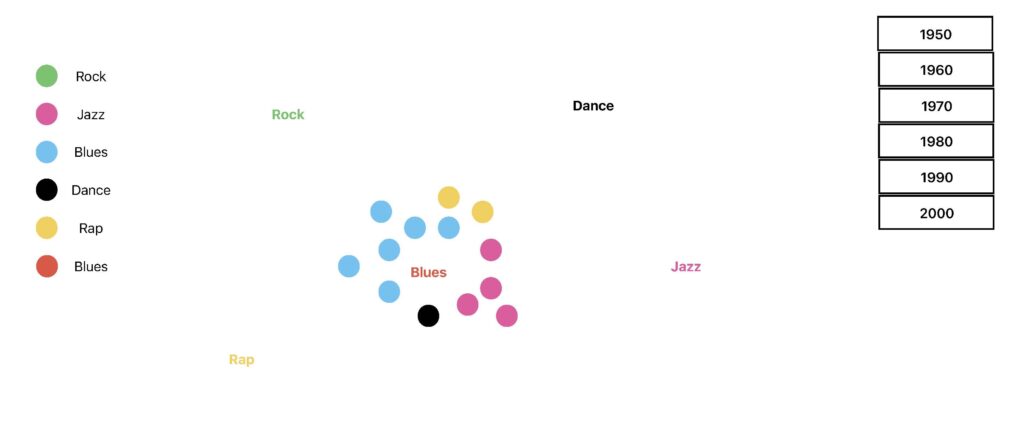
Initially, I planned to visualize genre compatibility and popularity. My first concept featured the most popular genre at the center, surrounded by related genres, but this design failed to showcase less dominant genres effectively. Another idea to display all genres together proved visually cluttered and overwhelming for users.
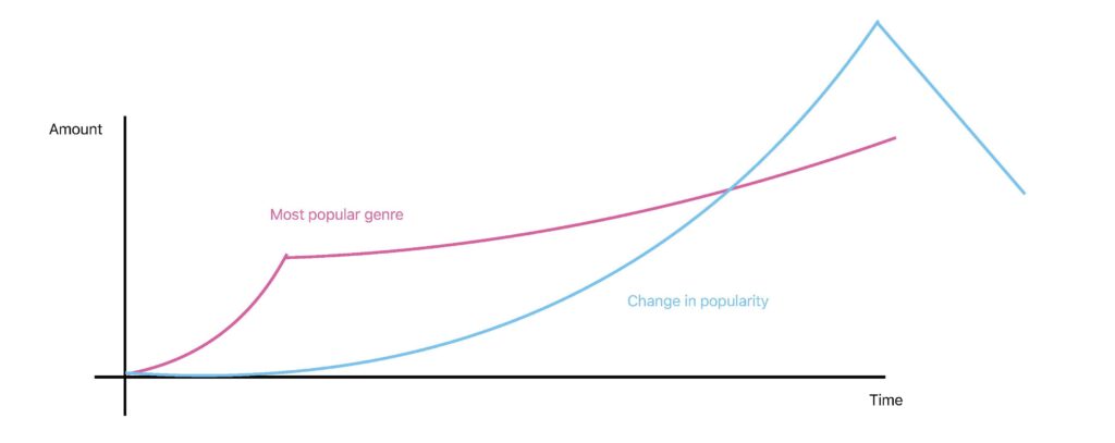
To address these challenges, I focused on a cleaner solution: comparing the most popular genres with those showing the highest percentage growth over time. This approach highlights meaningful trends and provides insights into how socio-economic factors and artistic movements drive genre evolution.
Popularity Page Progress
I explored various approaches to visualize genre popularity, using symbol size or quantity to indicate prominence. Ultimately, I chose a timeline format for its intuitive representation of chronological data, ensuring clarity and ease of interaction.
To create the popularity visualisation, I extracted and processed dataset values, calculating each genre’s popularity for a given year. To address year-to-year variations, I normalised the data by scaling popularity values to a range of 0–50, with the most popular genre assigned 50 and others adjusted proportionally. This approach ensures clarity and allows for adjustments as the project evolves.
Comparison Page Progress
Why Line Charts? Line charts were chosen for their clarity in comparing genre trends, with two side-by-side charts to separate raw popularity and percentage-based growth.
Key Interactive Features A checkbox interface replaced dropdowns, allowing users to select genres and dynamically update the charts, making exploration intuitive and engaging.
Data Transformation Popularity data was structured to show how each genre performed during specific decades. Additional calculations were done to show how each genre's popularity changed over time in percentage terms, highlighting growth trends.
Final Enhancements Distinct colours, thicker lines, and scaling adjustments improved readability, effectively showcasing steady trends (e.g., Rock’s dominance) and rapid growth patterns.
Interactive Zoom Feature: Introduced a brushX tool to allow users to zoom into specific chart sections, enhancing data exploration and usability. Clean boundaries and clear axis labels ensure readability, while automatic resets simplify interaction for a better user experience.
Compatibility Page Progress
Started by displaying all genre names and considered an interactive design where hovering over a genre would branch out related genres in a circle. After testing, I chose to stick with the original design for better clarity and functionality.
Initial Design and Data Processing: Data was structured by calculating percentages for each genre’s compatibility relative to others. A dropdown menu was added to allow users to switch genres and dynamically update the table.
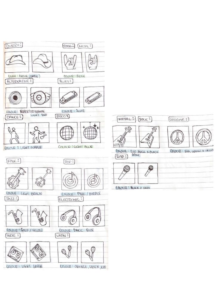
Table Design Evolution: Initially, all genre compatibilities were displayed, but this was refined to show only the top 5 most compatible genres for clarity and efficiency. Genres with minimal relevance were removed to reduce clutter.
Improved User Experience: The table layout was adjusted to display years as column headers, creating a more intuitive timeline effect. Hovering over images now displays detailed genre information for better accessibility.
Dataset Complexity: Working with a matrix-format dataset required extensive transformation and normalisation to ensure meaningful comparisons across decades. This preprocessing step was critical before starting the visualisations.
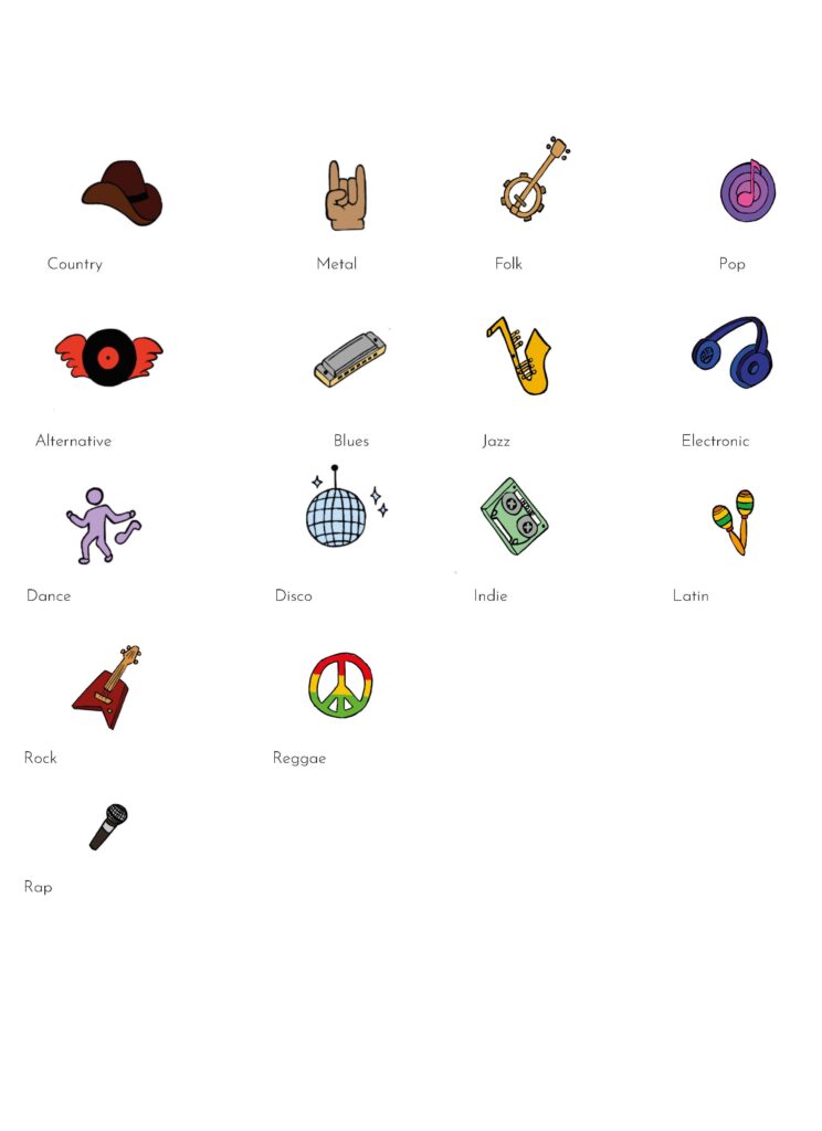
Managing Genres: Displaying data for 15 distinct genres posed challenges in creating a clear and user-friendly design. Balancing comprehensive information with simplicity required significant planning, trial, and iteration.
Future Impovements
Enhanced Accessibility: Introduce alt text and voice-over options to accommodate a wider audience, alongside symbols to support color-blind users.
Responsive Design: Optimise the visualisations for various screen sizes, ensuring consistent user experiences across devices.
User-Friendly Features: Add a legend dropdown menu to improve navigation, allowing users to easily interpret symbols and corresponding genres.